By Ryan Signorino
Staff Writer
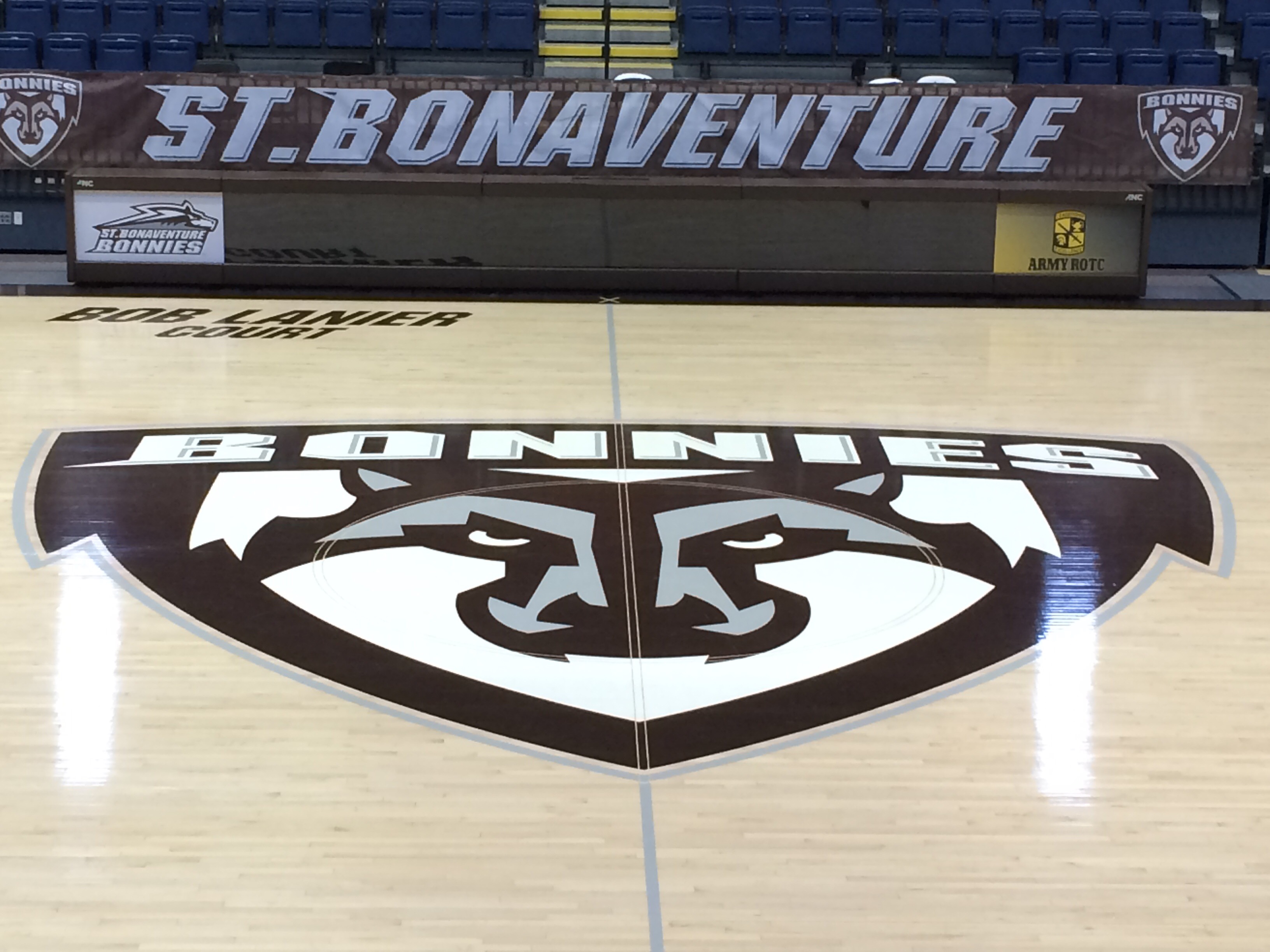
The Reilly Center floor received an update this year and has already been a part of its fair share of long-range three-pointers, alley-oops and the occasional court storm.
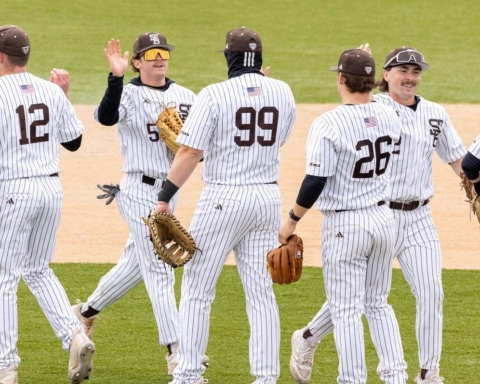
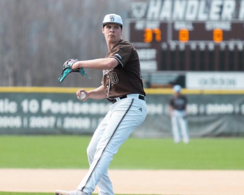
The center of the court boasts the updated St. Bonaventure University athletics logo. Gone are the gold accents on the Bona wolf, replaced with what Director of Athletics Tim Kenney calls a silver-gray color to compliment the school colors of brown and white.
Kenney, who was named director of athletics in March 2015, began thinking about a color change around a year ago after seeing all the sports teams’ uniforms and noticing that many of them were different.
“The gold-yellow color, when you saw it on uniforms, it always looked different,” Kenney said. “The men’s basketball shooting shirts, it was a faded yellow, other ones were a bright yellow, and we kept looking at it and saying, ‘This doesn’t make sense. Our colors are brown and white.’ Yellow is an accent color, and we said, ‘Let’s take a look at the brown and white with a silver-gray.’ It looked so much better in the end.”
The athletics department started looking at image treatments of current logos with the gold color replaced with a silver-gray, and it was a hit, Kenney said. They began to realize the logo didn’t need the gold accents, and they made the decision to change it over to gray.
Besides the color switch, the two St. Bonaventure logos remain the same. The primary logo, the “running wolf,” which Kenney said is less used than the secondary, still features a small yellow accent as the wolf’s eye. The secondary “shield” logo loses all of the gold from the snout.
“We weren’t going to go through a whole logo change,” Kenney said. “We figured we could tweak [the colors.] We knew this was an easy, effective way to get where we wanted to go with it.”
The Reilly Center received a makeover, getting a new court with the logo emblazoned in the center, the new logo on the new video screen over the court and the new logo on all the coaches’ offices around the building. However, some of the logos around campus still have the gold accents, most notably, the turf field and scoreboard on the Marra Athletic Fields Complex.
“The scoreboard we should hopefully be able to tweak and change. The turf is a whole other project, and that was done three years ago. We might have to live with that for a while, and that’s okay,” Kenney said. “It’s a little more tan, and it’s not the gold, so we can live with that, because it is in the color palette of brown. For now, the turf is going to have to stay the way it is, because that’s an added cost that’s significant. I don’t see it as a necessity. It’s more of an annoyance.”
In the Reilly Center, the only other logos that would need to be switched over are on the banners. Kenney sees these as a significant extra cost and thinks the banners would be better off left alone.
“If you look at the Reilly Center, with the new floor, it has the new color palette, so everything else we’ve done is that,” said Kenney. “We can live with those up there, and it might pay a little homage to the past, that those teams had the yellow in them.”
Kenney added, while it wouldn’t be cost effective right now, the athletic department is looking to add another secondary logo that doesn’t feature a Bona wolf, but is just a “B” for Bonaventure.
In the end, the school’s logo and colors is all about branding and making sure people recognize it. Kenney said he would like home uniforms to have “Bonnies” on them, but when teams are on the road, they should say “St. Bonaventure” so people can put a name to the school.
With the color switch, it gives a lot less leeway on colors and shades they use on their gear, which makes the school’s athletics look more cohesive overall.
“Now all our teams have the same color-dynamic look. It goes from an image standpoint and a branding standpoint, but in the end, a stylistic standpoint of looking better,” Kenney said.
signorra15@bonaventure.edu